THE
MUTAMATHIL TYPE STYLE: Towards Free, Technology-Friendly ‘Arabetic’ Types *
Saad D. Abulhab
The Arabetic typography
Main problems of the Arabetic typography
Arabetic typographical solutions:
review
Design Principles of The Mutamathil Type Style
One glyph or shape per character
A glyph is generally symmetric around its vertical axis to facilitate bi-directionality
Glyphs have independent forms to render non-cursive text
Glyphs fit within specific boundary dimensions
Glyphs must resemble their traditional forms
Related types must maintain the principles of
design
Print PDF Version
Abstract
Efforts to adapt various Arabetic scripts to the machine
are as old as the field of typography. But most of these efforts concentrated primarily
on forcing the machine to duplicate the Arabetic handwritten forms. Others have
practically advocated divorce from the calligraphic tradition rather than
enrichment and reform. One reason why the few modern attempts to
typographically solve the technology-induced Arabetic script problems had
failed is that many typeforms (or many times just theoretical calligraphy
style) was presented as replacement for the traditional ones rather than as
optional working types. New “controversial” types should be made widely
available for users to experience and judge rather than be dismissed based on
unsupported claims or verdicts by a few influential individuals. Through the
open design of the Mutamathil type style, the past restrictive,
calligraphy-based, Arabetic typography is overcome and a more progressive
development path is established. This is an open system that produces Unicode
compliant, technology-oriented, fonts to work side-by-side to the traditional
ones. Such fonts not only work with current Arabetic applications but also
facilitate future creative ones.
Introduction
Typography is the art of automated calligraphy, however it must adhere to the key principles behind automation, which are mass production and its underlying economic goal. Despite its roots in, and association with, the art of calligraphy, typography has emerged as an independent field. A type designer should begin in calligraphy but should use it as a design base only when it facilitates automation. Due to this key goal of serving automation, type design and its application as typography is closely linked with other fields of technology and industry. It is a field combining both art and science, like architecture. Types (or typefaces or fonts) and their designs are at the heart of the field of typography. Fonts were originally developed as metallic letter sets of particular calligraphy designs, which were appropriate for the early stages of the mechanized paper printing process. Modern day fonts are systems of software-based digital fonts, which can facilitate many visual representations aside from the printed one.
Historically, typography emerged in Europe as “the demand for more speed than the scribes could provide made some means of more rapid production necessary.”(1) It evolved during the Industrial Revolution into an industrial field governing the process of mass production of the Latin-based written forms. To serve this process of automation, these written forms were eventually altered and standardized in their overall appearances. The early, wood engraved, block types and the first movable types attempted to duplicate various handwriting forms. (2) But they gradually moved ahead of their handwritten models when it became apparent that letters’ shapes were easier to cut and print individually. (3) “In the early days of the craft, when printing was beautiful, writing was the model; whereas today printing is held superior to writing.”(4) Consequently, the new model or standard type paved the road for the many changes occurring during the following centuries. Handwritten texts of the old manuscripts and engraved block books contained mostly connected letters were replaced by texts of individual letters. The number necessary base letters and shapes needed to represent the previous calligraphic varieties became fixed and normalized. The visual appearance of several letters was altered to accommodate the limits of the machinery and industry. Ligatures, one shape representing two letters or more, either disappeared or became infrequently used. In some cases, an accented letter was either transformed into an independent letter or was replaced by two existing letters. The fixed set of independent characters on a typical Latin typewriter or keyboard today summarizes these revolutionary changes. Current printed or visual Latin forms vaguely resemble the old ones. It is a challenge to read an old English or German book from a few centuries ago! Similar changes also affected the written forms of other non-Latin languages in Europe like Russian and Greek.
The history of human writing forms offers many examples of how a nation’s writing can be changed dramatically over the years. Adaptation to new needs was almost always the main driving force behind most of these transformations. The handwritten texts of one thousand year old Arabic manuscripts differ greatly from the printed texts of modern books. Many Arabic letters today do not even resemble the old ones. (5) For many languages, the number or definition of letters have changed, too; and changes did not necessarily occur over very time long periods. The Japanese and Chinese languages, which not so long ago were oriented right-to-left, top to bottom in writing order, are now read from left to right. Hebrew in its transformation from an ancient language to a modern one has experienced writing reform as well. Historically, the need for adaptation has rarely transformed a language writing form overnight and has rarely caused it to disappear. But modern adaptation to industry and technology has shortened the time period for transformation. It has also threatened or sometimes forced many non-Latin writing forms to become either secondary or to disappear. The extreme and unnecessary abandonment of the Ottoman Arabic based letters in modern Turkey is a good example. It was justified, at least partially, as a reform step adapting to modernity and technology, and as a key factor in improving literacy. It was a costly surrender to technology as well as an abandonment of the goals of adaptation, literacy, and reform. Among other results, it permanently denied the Turkish people the ability to read thousands of their historical texts. For years, it even denied them the ability to effectively read or write their language. In contrast, a few decades ago, real adaptation occurred in Germany, when they replaced its historically rooted letterforms with current, commonly used Roman ones.
As with many other fields, the emergence of computers has transformed typography significantly. Software and font design have changed the ways in which we read or write the old printed forms. Digitization has quickly gained dominance; just visit the World Wide Web. Globalization has emerged as a major challenge to typography. Today, the text writing and rendering of any language must rapidly adapt to creative, flexible, and economical type designs. Because the early computers were originally designed to handle Latin letters, the subsequent progress of the non-Latin typography became even more dependent on non-native, external factors. Internally, for example, most software programs and systems display text in a left-to-right order and are designed to render characters in isolated forms. Therefore, to adapt to an emerging technology, while strictly following the rules of an old calligraphy, the non-Latin languages needed a greater investment to develop software and acquire the technical expertise in order to accommodate the limitations of the dominant Latin-based technology. Most of the non-Latin typography handled on today’s computers, became captive of the Latin software producers who gladly charged very high fees tweak their systems to generate these nonstandard scripts. Unlike the natural and healthy evolution of Latin typography and its machine-friendly writing forms, non-Latin typography progress concentrated primarily on how to alter the machine to duplicate old, detailed and ill-suited calligraphy rules; thus maintaining old writing forms. One can point out many expensive attempts, both successful and unsuccessful, to accommodate Chinese, Arabic, Hebrew, or other scripts on computers. In a way, many non-Latin languages missed a golden opportunity to truly reform their writing systems.
The distorted evolution of non-Latin typography finally settled down with the introduction of the Unicode standards sponsored by major software companies like Microsoft and Adobe. This was, without a doubt, a major step in conquering the “technical anarchy” that dominated the development of non-Latin software and typography. The result was that non-Latin type design and development became less expensive and more standardized. Mainstream type editors and other tools finally started to accommodate these complicated scripts. Thanks to the Unicode standards, one can read in many languages on the Internet today. But imposing these standards has potentially affected the evolution of non-Latin typography in a negative way. For many languages, it could reinforce and sustain their unevolved, calligraphy-oriented, letterforms. For example, the Unicode standards finalized a fixed number of basic required characters to render a given language. It endorsed the process of glyph (shape) substitution to represent characters as a minimum rule of design for certain languages. It imposed either right-to-left or left-to-right letter ordering as a native direction requirement for other languages. (6) Most of these rules were rooted in the distorted evolution of many non-Latin types during their struggle to adapt to the Latin-geared machinery. Although the Unicode compliant technology today is not as restrictive toward non-Latin text, it is still not as friendly with it as it is with the Latin text, which has reshaped itself historically to embrace technical change. It would be a mistake for non-Latin typography to settle forever on all of the rules imposed by the current Unicode standards. The machine must not be forced to duplicate all and every detail of the old calligraphy. Typography is about transforming calligraphy to adapt to the machine as much as it is about altering the machine in the service of calligraphy. Since most of the available and affordable technology is Latin based, non-Latin typography ought to adapt to it rather than reinventing the wheel. This fact is especially important in developing countries where adaptation can save many endangered writing forms from extinction. But despite some of its negative effects, the Unicode standards can be employed today as a primary tool to correct the path of the calligraphically obsessed past of non-Latin typography.
The Arabetic Typography
Nowhere was the previously mentioned distorted evolution of the non-Latin typography clearer than in the case of the calligraphy-oriented Arabetic typography. Arabetic scripts include all scripts or writing forms utilizing the original Arabic alphabet or an alphabet related to it through the addition or subtraction of a few derived letters and glyphs. Among these scripts are Arabic, Urdu, Persian, Baluchi, Kashmiri, Kazakh, Sindhi, Pashto, Lahnda, Kurdish, Dargwa, Uyghur, Turkic, Berber, Old Malay, Old Hausa, Adighe, and Inguish. The Unicode standards combined all these scripts into one script group referred to as “Extended Arabic.” It was classified further, along with few other scripts like Hebrew, as a complex script. “The term 'complex script' refers to any writing system that requires some degree of character reordering and/or glyph processing to display, print or edit”. (7)
Main problems of the Arabetic typography
Before detailing various proposals and designs, it is essential to first examine the technological problems of the Arabic-based scripts and the methods and solutions currently supported by the Unicode standards to visually display them. To type, render, or otherwise represent the Arabic language digitally, mechanically, or in ways other than by common handwriting, a minimum of 44 basic Unicode characters is required. Extended Arabic, used by more than twenty-one other distinct non-Arabic languages (e.g. Urdu, Persian, and Kurdish) necessitated the addition of 96 other basic characters, mostly derived from the original Arabic letters. Included with the basic characters are nine diacritics, and several ligatures. Diacritics, not used extensively by modern Arabic, are placed on top or below a character altering its shape when viewed within a fixed frame. Therefore, a total of at least 140 distinct basic Unicode characters are needed in order to accommodate all the written forms that are based on the extended Arabic character set as defined by the Unicode standards version 1.0. (8)
In reality, each of the base Unicode characters above is an abstract representation of a letter, diacritic or ligature, which can appear in any of several deferent forms called glyphs. (9) In its isolated form, each character is represented by a distinctive glyph. But within Arabetic texts, each character must change its shape, either significantly or slightly, depending on its position in a word. Ligatures that belong to the basic character set (e.g. Waw with Hamza above) also change their shapes based on their positions and are treated by computers as if they were normal letters. Other ligatures, like the Lam-Alif ligature, which are formed by replacing two or more basic glyphs by one glyph, are not included in the basic set. They too change shapes depending on their positions within words. Therefore, an average of two to five glyphs are needed for each character/ligature when typing or displaying any Arabetic script. Diacritics complicate this picture further since they produce additional shapes upon their placement. Since each letter/ligature does not have one uniform shape in all positions, the number of glyphs needed is not constant. In contrast, English is always represented by 26 letters and 52 glyphs. Producing a font for the extended Arabic set today minimally requires the design of 500-600 glyphs, depending on type or calligraphy style, compared to less than 200 glyphs to cover all Latin scripts. This also means that articles of manufacturer with Arabetic lettering embodied within (e.g. printers, hand held devices, computer software, stamping devices, or fonts) need to store a large number of glyphs. To this is added the need to manage the problem of constant glyph change, which introduces labor-intensive glyph definition tables and complex programming processes.
All Arabetic scripts are normally read and written from right-to-left. They are not easily written or read from left to right. But in some applications (e.g. aviation field) training is provided to write them from left-to-right. Handwriting or reading any Arabetic script from right-to-left is easy when acquired from childhood. But articles manufactured to utilize Latin lettering (e.g. computer software and hardware) must be altered or redesigned to accommodate the right-to-left direction mechanism. Letters of embodied Arabetic words in various mediums (e.g. transparencies, microfiche, negatives, printed paper) look different depending on the direction of reading. Therefore, bi-directional reading of such composed texts is difficult when using the right-to-left traditional glyphs (10). Numbers within Arabetic texts are ordered from left-to-right complicating further the rendering of these texts, because applications handling them must incorporate methods for bi-directional ordering not only right-to-left ordering. (11)
Unlike the glyphs of Latin letters, which can be written or displayed in both connected (cursive) and unconnected (isolated) forms, most glyphs of the Arabetic letters/ligatures must always appear connected within a word. A good number of these glyphs must join with others, both to their right and to their left. Some glyphs must join with the ones on their right but not with the ones on their left. Occasionally, glyphs must appear isolated within a word. And in rare cases (e.g. Ha used for a Hijri year) a glyph in its connecting form must appear isolated instead. Therefore, articles of manufacture designed to produce Arabetic lettering have to employ additional complicated processes or methods to handle these puzzle-like letter joining/non-joining possibilities. Also, many Arabetic scripts use an optional glyph “Tatweel”, which is a straight horizontal line (like a dash), to justify texts or to create visual effects. Tatweel can form arbitrary word lengths. For this reason, applications that need fixed letter widths cannot handle traditional Arabetic fonts easily.
Addressing these difficulties, programmers and Arabetic typographers introduced in the 1980’s many complicated, but brilliant, computer systems solutions. Most solutions were first handled by special additional software before being incorporated gradually within the operating systems. Endorsing the concept of the so-called “intelligent” fonts, the Unicode and Open Type standards later transferred many of these technical tasks (e.g. glyph substitutions definitions) to the type designer. (12) In both cases, this became a burden resulting in larger, more complicated, and expensive fonts and systems. In today’s computers, Arabetic glyphs constantly change their look with every keystroke. Positioning a cursor to correct a misspelling is time consuming. Mixing right-to-left texts with left-to-right texts can be a nightmare. Such difficulties, in addition to being truly annoying, are very discouraging to new learners, putting the Arabetic scripts in a real disadvantage when competing globally.
Arabetic typographical solutions:
review
Like Latin types, Arabetic types have their roots in the centuries old rich Arabetic calligraphy. Arabetic books were handwritten by calligraphers, prior to the emergence of mechanized printing. The earliest attempts to print Arabic letters using movable parts appeared at the beginning of the sixteenth century in Europe. Copper and lead type components to print today’s most circulated Arabic Naskh type, are displayed in the Imprimerie Nationale in Paris. (13) Ironically, today’s commonly used version of the Naskh calligraphy or type was refined by the Ottoman Turks in the 16th century and was adapted as their official writing form. (14) Natively unfamiliar with the Arabic script and its history, the Europeans who solved the earlier problems of the Arabetic typography mainly concentrated on how to precisely duplicate various calligraphy styles on printed material. After all, typesetting with its static nature can more or less accommodate any written form. These early solutions deprived the Arabetic scripts of a true reforming attempt to rethink the obstacles of their strong calligraphy dependence in order to produce truly machine-friendly types. Later on, typewriters, facing these same ignored obstacles, came up with some relatively courageous and creative typographical solutions. Some letters were assigned fewer position-dependent shapes. But the typewriter failed to move the Arabetic scripts into the typography age. With the emergence of computers, the few positive typewriter-based attempts at simplifying the Arabetic written forms, quickly evaporated. Arabetic typographers were again busy duplicating calligraphy to its fullest detail in their types.
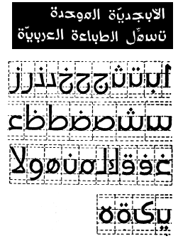
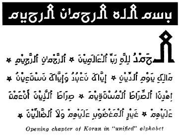
Facing the challenges of typography in the early 1930’s, the Academy of the Arabic Language in Cairo outlined few proposals to simplify Arabic writing. These proposals included the reduction of the number of shapes per letter, the inclusion of Arabic accents as extra letters, the normalization of letterform sizes, and the elimination of diacritic dots. (15) Many serious reform attempts to produce technology-friendly types surfaced in the past decades. (16) (17) Some of these attempts were very creative, while others were basically artificial or arbitrary imitations of the Latin, Hebrew, or Indic writing forms. FIGURES 1 and 2 show two samples of proposed type or calligraphy styles, that are truly outstanding. The first one, by the Lebanese architect and artist Nasri Khattar, was introduced in 1951 under the name of “al-Abjadiyah al-Muwahaddah” (or the unified Arabic alphabet.) The second one, by the Egyptian type designer, Murad Butrous, was introduced in 1993 under the name of “al-Khatt al-Arabi al-Mubassad” (or the simplified Arabic script.) Farsi type designers also made attempts to accommodate computer software. A completely different approach by Justin Majzub of England, detailed a method for chopping the Arabic letters into a fixed number of shapes, creating segments of characters to be reconstructed later to form any desired glyph. (18) The fixed number of segments presumably would make up a future keyboard or be used behind the scene as part of the internal processes involved in displaying Arabic glyphs. Mr. Majzub’s creative approach was another attempt to force typography to duplicate calligraphy to its fullest details. Practically it failed to accommodate automation and its economic purpose.
|
|
|
|
FIGURE 1 An Example of previous attempt to
simplify the Arabic writing. Sample text and the character set of the
“Unified Arabic Alphabet” by Nasri Khattar. 1951. From “A Brief Survey of Proposals to Simplify Arabic Script” by
Mamoun Sakkal. 2000. |
|
|
|
|
FIGURE 2 An Example of previous attempt to simplify
the Arabic writing. Sample text from the “Simplified Arabic Typeface” by
Murad Boutros. 1993. From “A Brief
Survey of Proposals to Simplify Arabic Script” by Mamoun Sakkal. 2000. |

Despite these serious efforts, the proposed designs left no major impact on contemporary Arabetic typography. The attempts to simplify Arabic writing generally failed to address several important issues. First, most solutions were introduced as alternatives to the traditional scripts, not as additional options. Also they did not advocate an open design principle by presenting solutions based on clear, defined, and flexible design rules. Second, they ignored the derived Arabic characters used by many non-Arabic languages. Third, they continued to approach type design calligraphically without sufficient knowledge of the technical side of modern computer font design and generation. Most of these proposals were purely theoretical. They did not produce fonts that can be tested for clarity at different sizes, for example. Forth, some of these designs truly violated the spirit of Arabic writing and ignored legibility. Also, many ignored addressing the vowel diacritics completely. Fifth, the required right to left ordering, which is technically the main challenge facing Arabic typography, was not addressed by any of these designs. Sixth, while some of them unnecessarily considered the removal of the crucial diacritic dots, all designs insisted on keeping the Lam-Alif and other ligatures. Finally, most designs either required letters to be connected or isolated instead of addressing both cases. And the few designs that suggested letter separation imposed equal spaces between all glyphs failing to include the important visual effects of the traditional letters joining/non-joining process.
The Mutamathil Type Style
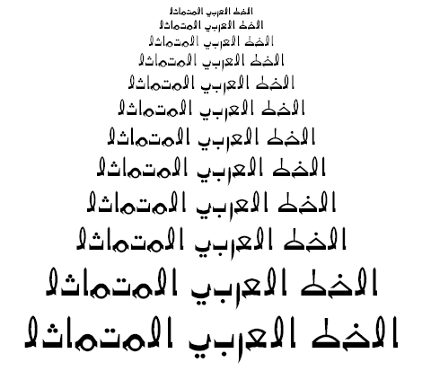
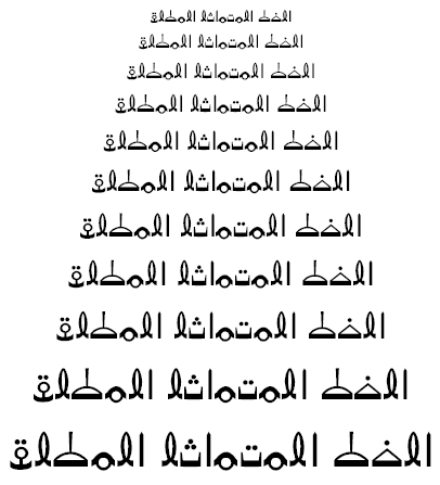
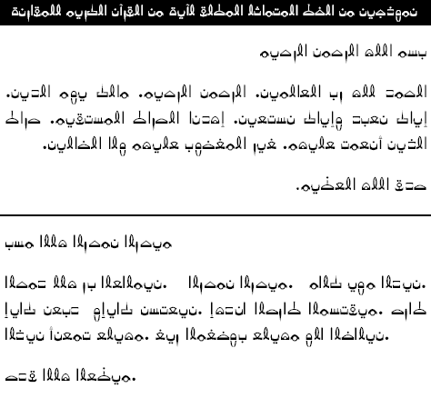
To overcome the above-mentioned technological problems and other obstacles facing the Arabetic scripts, a new style of types is outlined with its unique design principles; it is the “Mutamathil” (or unified and symmetric) type style. Briefly, this technology-oriented type style employs glyphs/characters representative of the extended Arabic characters; these are generally symmetric to facilitate bi-directional use, uniform to render a single glyph per letter, and independent to compose non-cursive text strings. It utilizes the advantages produced by the Unicode standards, which have helped conquer the chaotic state of the Arabetic typography through the adaptation of minimum design rules and procedures. Incorporating this type eliminates all major and unique obstacles faced by articles of manufacture utilizing the traditional Arabetic alphabets. It creates a font-only, software-independent character input/output system intended to facilitate the use of Arabetic lettering on articles designed for Latin lettering, with a slight or no alteration of such articles’ original design. Articles of manufacture with the embodiment of this new lettering (e.g. computer software and hardware, communication systems, image printing, translation software, Arabetic languages teaching tools) can be produced with significantly less complexity to deliver the extended Arabic texts in a form closely resembling their traditional ones. For samples of Mutamathl texts in Arabic, Farsi, and Urdu (SEE FIGURES 3-8).
|
|
|
FIGURE 3 The Mutamathil type at
different point sizes |
|
|
|
FIGURE 4 The Mutamathil Mutlaq type at different point sizes |
|
|
|
|
|
FIGURE 5 Computer-generated sample of
Arabic text illustrating Mutamathil type |
|
|
|
|
|
FIGURE 6 Computer-generated sample of
Arabic text illustrating our bi-directional Mutamathil Mutlaq type (Compare
to same text in FIGURE 5.) |
|
|
|
|
|
FIGURE 7 Computer-generated samples of
Farsi text in the Mutamathil type (above) and Mutamathil Mutlaq type
(bottom). |
|
|
|
|
|
FIGURE 8 Computer-generated samples of
Urdu text in the Mutamathil type (above) and Mutamathil Mutlaq type (bottom). |
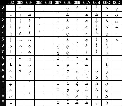
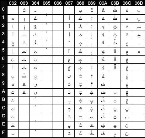
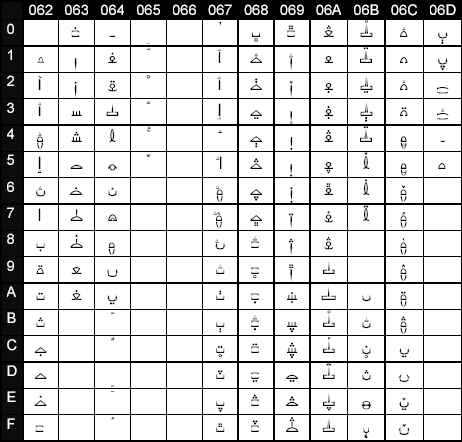
The reference TABLES 1, 2, and 3 include glyphs/Unicode characters of the two members of our proposed type style. Notice that the glyphs in each of these tables correspond, in a one-to-one relation, to all Arabetic characters both in their isolated and non-isolated forms. The design of our glyphs is mostly based on the Arabic Kufi type and calligraphy. They clearly resemble traditional Arabetic glyphs. The style or look and feel of these revealed glyphs reflect the personal implementation vision of the design principles of the Mutamathil type as understood by this author; this is discussed later in the article. This style is limited by calligraphic and artistic experience and capability. TABLE 1 reveals the original glyphs for the Mutamathil type, which can only be employed for right-to-left applications. Compare these with the glyphs of TABLES 2, and 3, which are slightly altered ones of the same type style. These belong to the “Mutamathil Mutlaq” (directionless Mutamathil) type, which includes two differently encoded (same codes used in the tables only for comparison) sets of mostly identical glyphs that can be used for both right-to-left, and left-to-right applications.
|
|
|
TABLE
1 Mutamathil
type glyphs of the basic characters for the extended Arabic Unicode block, for
right to left utilizations. |
|
|
|
TABLE
2 Mutamathil
Mutlaq (directionless Mutamathil) type glyphs of the basic characters for the
extended Arabic Unicode block, for right to left utilizations. |
|
|
|
TABLE
3 Mutamathil
Mutlaq (directionless Mutamathil) type glyphs of the basic characters for the
extended Arabic Unicode block, for left to right utilizations. |
The Mutamathil type style proposes a technology-oriented, computer-friendly, minimal type style. A type capable of closing the gap between the Arabetic scripts on one hand, and both technology and other simpler world scripts on the other. The author is not advocating the abandonment of the daily newspaper types or common writing forms. Producing reasonably legible texts, the Mutamathil type is intended to fulfill the immediate prototype needs of the Arabetic scripts to ensure that they can keep up with any emerging technology. Using this type, Farsi speakers, for example, would not need to Romanize or transliterate Farsi words when communicating with email or in chat rooms. Instead, they can write Farsi left-to-right utilizing the Mutamathil Mutlaq type. Also, learners of various Arabetic writing systems can use this simplified type as an introductory tool to read and write their languages. Through this design, a new step is taken in the same direction adopted by many open-minded modern type designers, who aimed to simplify and standardize Arabic-based scripts. The call to free the Arabic type forms from its restrictive calligraphy is similar to the highly successful calls of the twentieth century to free the Arabic poetry from its restrictive historical rules. The call is not to abandon the traditional Arabetic calligraphy and fonts, but to enrich them by providing new flexible alternatives.
Design Principles of The Mutamathil Type Style
Generally, the type style employs glyph symmetry and uniformity as its design basis by representing each letter with a single glyph of unique, symmetrical, and independent appearance, resembling one of the traditional glyphs of that letter. As a result, the approach creates new distinctive Arabetic alphabets or written forms. Keeping the symmetry and uniformity principles, a variety of fonts belonging to the same type style can be produced. Altering glyph design, partially or totally, through the application of systematic or geometric change on glyph symmetry, can also create new fonts that can be utilized for their new look, direction suitability, or both (SEE FIGURES 9-11). The six major principles (or rules) used to achieve the design goals of this type style are explained below.
|
|
|
FIGURE 9 Computer-generated samples
Arabic text of the Mutamathil type |
One glyph or shape per character
Every character in our Mutamathil type is represented by one shape or glyph, regardless of its position in the word. At the heart of the design is the elimination of the glyph forming process, which performs one-to-one, one-to-many, or many-to-one glyph substitutions in order to display a traditional text. Since Arabetic computer characters include not only the officially accepted letters, but also a few other required ligatures and diacritics, the one glyph per character principle extends to them as well. The type eliminates all glyph substitutions including the ones related to the Lam-Alif ligature. This Alif-Lam ligature elimination reduces further the number of required Unicode glyphs. And, as an additional benefit, it frees four assigned keys on a typical input device. In a keyboard, for instance, these free keys can be assigned for other basic letters or symbols. To be specific, this approach creates a new system wherein Arabetic alphabets are represented by a minimum number of around 140 glyphs, compared to the minimum number of 500-600 glyphs now required depending on type. The number covers all extended Arabic letters, ligatures and diacritics as defined by the Unicode standards. It would be a fixed number independent of type or calligraphy.
A glyph is generally symmetric around its vertical axis to
facilitate bi-directionality
One goal of the type style is to end the traditional dependence of the Arabetic texts on unidirectional character ordering. Every one of the glyphs is designed either exactly symmetric or semi-symmetric around its vertical axis. When flipped horizontally, every glyph maintains the distinctive features of the same glyph prior to flipping. Looked at individually from left-to-right or right-to-left, each glyph has its general characteristics preserved and is visually identical. Glyphs that do not natively have any form of symmetry, based on their positions in the traditional Arabetic word (e.g. Kaf, Dal), are first designed completely symmetrical, but are then slightly altered to produce semi-symmetric glyphs resembling the traditional ones. The nature of this alteration determines whether they are going to be used in right-to-left or left-to-right applications. The Mutamathil type words, which are spelled the same but have their letters arranged in opposite order, would mirror each other. Reverse ordering a given word will produce a characteristically identical word when looking at it from the opposite direction. Therefore, it is possible to read a left-to-right ordered Mutamathil text without looking turned around as in the case of reading a horizontally flipped right-to-left ordered traditional Arabetic text (SEE FIGURE 10). To display texts in either direction one needs to utilize two slightly different, direction specific, fonts. (COMPARE THE GLYPHS OF TABLE 2 AND 3.)
|
|
|
FIGURE 10 Two computer-generated
samples of Arabic text in the Mutamathil Mutlaq type illustrating its
bi-directional capability. |
Glyphs
have independent forms to render non-cursive text
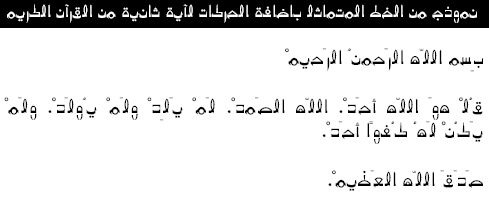
Freeing the Arabetic texts of their required, calligraphy-inherited, cursive forms is another goal of the type style. Glyphs can be displayed slightly separated (isolated) or even connected within a word without loosing their visual characteristics. Therefore, words composed of these glyphs look basically the same in both cases. Also, the resulting spaces between glyphs when separated are not uniform or equal; extra space is added to the left or right (depending on the direction of writing) of both sides of the glyphs corresponding to the traditional Arabetic letters/ligatures, which either join from the right only, or do not join at all, with other letters/ligatures, in order to maintain the traditional visual effects of the non-joining appearances of these glyphs within the new non-cursive environment. This glyph built-in static solution eliminates the need for additional system processes to handle the traditional problem of letter joining/non-joining. Specifically, extra spaces are added to the glyphs for Hamza, Dal, Ra, Alef, Waw and their derivatives. Diacritics can be inserted within the double space produced by two adjacent unconnected glyphs. Therefore a glyph would look the same when viewed within a frame before and after adding diacritics (SEE FIGURE 11). Combined diacritics, like “Shadda with Fatha” are treated by the type style as independent diacritics in order to end completely the need for glyph substitutions. For this reason, three diacritics are added, “Shadda with Fatha”, “Shadda with Kesra”, and “Shadda with Dammah”, now assigned Unicode numbers FC60, FC61, and FC62, to the Unicode basic group of vowel diacritics under Unicode numbers 0653, 0654, and 0655. (SEE TABLES 1, 2, AND 3.) It is important to point out that the type does not eliminate the vowel diacritics, but like most other modern types, it discourages their excessive use.
|
|
|
FIGURE 11 Computer-generated sample of
Arabic text of the Mutamathil type illustrating diacritics insertions |
Glyphs fit within specific boundary
dimensions
When isolated in a design frame, the main body part of any of the new glyphs would fits uniformly between two horizontal and two vertical guidelines of specific x-y coordinate values. FIGURE 12 shows the seven horizontal guidelines, Y1 through Y6 and the X-axis, and the two vertical guidelines X1and X2, which are used by the designs. The guidelines Y1, Y6, W, and the Y-axis form a glyph design frame. Next to each horizontal guideline a group of Unicode names of Arabetic characters is indicated that use that guideline as one of their boundaries. Font designers can determine the values of the Y variables. But these values should be chosen carefully to maintain the proportional sizes of all glyphs in a type. For most glyphs, X1 is set to equal (W-X2) in order to produce identical spaces around a glyph. Where W is the design frame width, this can be fixed or variable to produce fixed or variable width fonts. For specific glyphs (e.g. Dal, Ra) X1 is greater or less than (W-X2), depending on the location of the extra spaces added to achieve a desired directionality and to handle the join/non-join problem discussed previously.
The placement location of dots or other diacritics above or below the main body of a glyph is not restricted by the guidelines. Also, each glyph has a line of symmetry S regardless of being completely symmetric or semi-symmetric.
|
|
|
FIGURE 12 Design guidelines of the basic Arabetic glyphs for the
Mutamathil type style. |

Glyphs must resemble their
traditional forms
Each Mutamathil glyph incorporates the visual characteristics of a specific Arabetic glyph either in its isolated form or in one of its other varying forms within words, or both. Before designing the glyphs, special attention was given to the historical shape changes of the Arabic letters and their varied designs under major calligraphy schools. Attention to the statistical occurrences of various glyphs within texts was also a consideration. Therefore, all of glyphs are easily recognized as Arabetic glyphs and are readily distinguishable from each other.
Related types must maintain the principles
of design
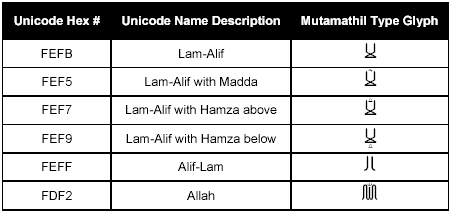
The Mutamathil type style adapts an open design approach. If, while altering or redesigning glyphs, the basic rules of design are observed, similar new type is produced that will yield its exact functionality. A slight or total elimination of symmetry in either a few or all glyphs, when applied systematically and geometrically, will produce a variety of direction-specific types. Keeping the uniform single glyph per character relation and completely eliminating symmetry produces glyphs similar to the position-specific traditional Arabetic glyphs (or their horizontal inversions). Again, the resulting types would be either right-to-left or left-to-right implementations of the original type. Keeping the uniform single glyph per letter relation, while increasing or decreasing the number of basic characters, also produce closely related types. For example, two basic characters/glyphs basic for Urdu and Kurdish are added to the Unicode minimum set, in order to improve their legibility. (See the characters with Unicode numbers 06BF and 06CF shown in TABLES 1, 2, AND 3.) Additionally, one can add glyphs for some essential traditional Arabic ligatures (e.g Lam-Alif) or new ones (e.g. Alif-Lam) to improve legibility or typing speed. Such added glyphs should observe general symmetry, and unless agreed upon universally, they should not be added to the basic required characters set, in order to keep the one-glyph, per one-letter, per one-key relation (SEE TABLE 4, AND FIGURE 13.) Finally, the Arabic glyph “Tatweel” can still be used with this type style without sacrificing legibility in most cases.
|
|
|
TABLE 3 Examples of possible added ligatures. |
|
|
|
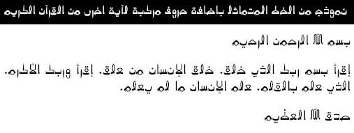
FIGURE 13 Computer-generated sample of
Arabic text including optional ligatures. |
Conclusion
The goal of this type style is to make the Arabic script and its derivatives more technology-friendly without eliminating their traditional characteristics. Effectively, distinctive Arabetic alphabets with a minimum constant number of characters with unique non-varying shapes are created, to simplify the handling as independent forms to render non-cursive strings and to facilitate bi-directional use via generally symmetric outlines. Each letter in the font has the visual characteristics of one of its traditional glyph variations. The look and feel of the Mutamathil glyphs are determined by the personal calligraphic and artistic experience and ability of the designer in his or her implementation of the design principles of this type style. The solution provides a platform-independent, font-only-based, character input/output system or method, eliminating many currently required processes. Unlike current Arabetic fonts, this font has a significantly smaller size. In the final result, articles utilizing this type style, such as computerized systems or language learning tools, can overcome much of the current obstacles related to the application of Arabetic lettering.
References
- Goudy, Frederic W. 1940. Typologia: Studies in Type Design and Type Making. Berkeley: University of California Press. Chapter 2.
- Goudy, Fredric W. Typologia, Chapter 3.
- Goudy, Fredric W. Typologia, Chapter 5.
- Goudy, Fredric W. Typologia, Chapter 3.
- Ghulam, Yusuf Muhammad. 1982. The Art of Arabic Calligraphy. Review samples.
- The Unicode Consortium. The Unicode Standards Version 1.0.
- Hudson, John. 2000. “Windows Glyph Processing”. Microsoft Typography. http://www.microsoft.com/typography/default.asp
- Abulhab, Saad D. 2000. US Patent 6,704,116. Also US Design Patent 435,584
- The Unicode Consortium. The Unicode Standards Version 1.0.
- Abulhab, Saad D. US Patent 6,704,116.
- Bishop, F. Avery; Brown, David; Meltzer, David M. 1998. “Supporting Multilanguage Text Layout and Complex Scripts with Windows NT 5.0.” Microsoft System Journal. November. http://www.microsoft.com/msj/1198/multilang/multilang.aspx
- Hudson, John. “Windows Glyph Processing.”
- AbiFares, Huda Smitshuijzen. 1998. “Arabic Type: A Challenge for the 2nd Millennium.” Baseline International Typographics. 26.
- Sakkal, Mamoun. 1993. “The Art of Arabic Calligraphy.” Part 4: The Art of Arabic Calligraphy. http://sakkal.com/.
- AbiFares, Huda Smitshuijzen. “Arabic Type.”
- AbiFares, Huda Smitshuijzen. 2001. Arabic Typography: A Comprehensive Sourcebook. Saqi. Review samples.
- Sakkal, Mamoun. A Brief Survey of Proposals to Simplify Arabic Script. 2000. http://sakkal.com/. Review samples.
18. Majzub, Justin H. V. 1993. US Patent 5,407,355.
Author Notes
The adjective word “Arabetic” is a new word introduced in this article by the author as a more descriptive and inclusive alternative to the word “Arabic” when referring to various scripts using the Arabic letters, and their related applications or embodiments.
![]()